Analyses
This section hosts an overview of all the analysis categories performed inside the platform. Analyses differ from the type and granularity of the analysed component. The basic block for the data available in the platform is the analysis of the runnable/function. Starting from the performance details available in this analysis, it is possible to obtain the subsequent analyses.
Currently supported analyses categories are:
Runnable Performance
The starting point for the analysis of a piece of software is the generation of its HPROF file. HPROF files can be uploaded in this section of the platform (both with REST API or manually) to obtain a performance report.
Each HPROF file can produce multiple performance analyses, depending on the number of ECU Type defined. For each ECU type, it is possible to obtain an analysis on a specific core of the ECU. Each entry can be classified with specific tags, that help filtering the desired HPROFs while performing specific analyses.
A performance report is an interactive document composed of multiple sections that provide performance information of a software targeting a specific ECU type. The analysis can be obtained simulating an average or longest execution. The analysis is performed by stimulating the software multiple times, depending on the provided input. The first one will provide average numbers based on the dynamic analysis performed stimulating the code with the provided dataset during HPROF file generation; while the second one will provide the analysis obtained with the dataset originating the longest execution time.
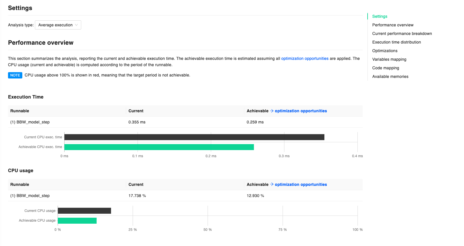
Performance Overview
The section summarizes the analysis, reporting the current (in black) and achievable (in green) execution time. Achievable execution time is estimated assuming that all the Optimization opportunities are applied to the code. Data regarding CPU usage (both current and achievable) is computed according to the period of the runnable either specified by hand or collected by the Huxelerate utility during the HPORF generation.
Whenever CPU usage is above 100%, data is shown in red, meaning that the target period is not achievable.
Code coverage and cyclomatic complexity are also provided in this section, to give an overview of the code complexity and the amount of code executed during the analysis. If multiple runnables are under analysis, respective bar graphs are also provided to compare the metrics for different runnables.
Current Performance Breakdown
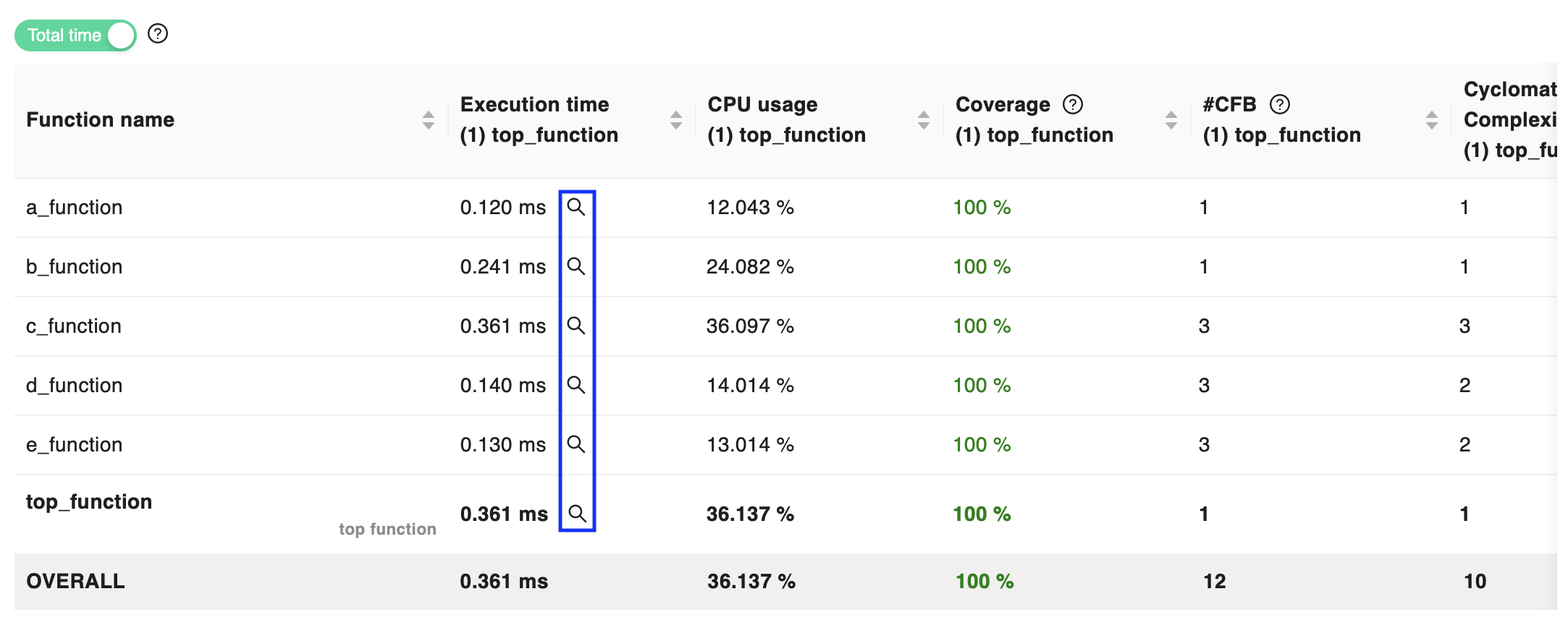
The performance breakdown provides information about the execution time and CPU usage for each function involved in the execution of the runnable. For each function, the report provides data about both execution time and CPU occupancy, both in a pie chart and an interactive table that can be used to explore the functions in more detail.
While the pie chart provides a quick breakdown of the execution time in terms of functions’ self time (i.e. the time spent in the function itself, excluding the time spent in the called functions), the table allows to access both self time and total time (i.e. the time spent in the function itself, including the time spent in the called functions) for each function by switching the dedicated selector.
Moreover, the table reports the cyclomatic complexity of each function, to provide an indication of the code complexity, and the coverage percentage of the function, to provide an indication of how much of the code was explored by the execution during the dynamic analysis. These metrics can be used to assess the reliability and impact of the performance data.
Function Call Graph explorer
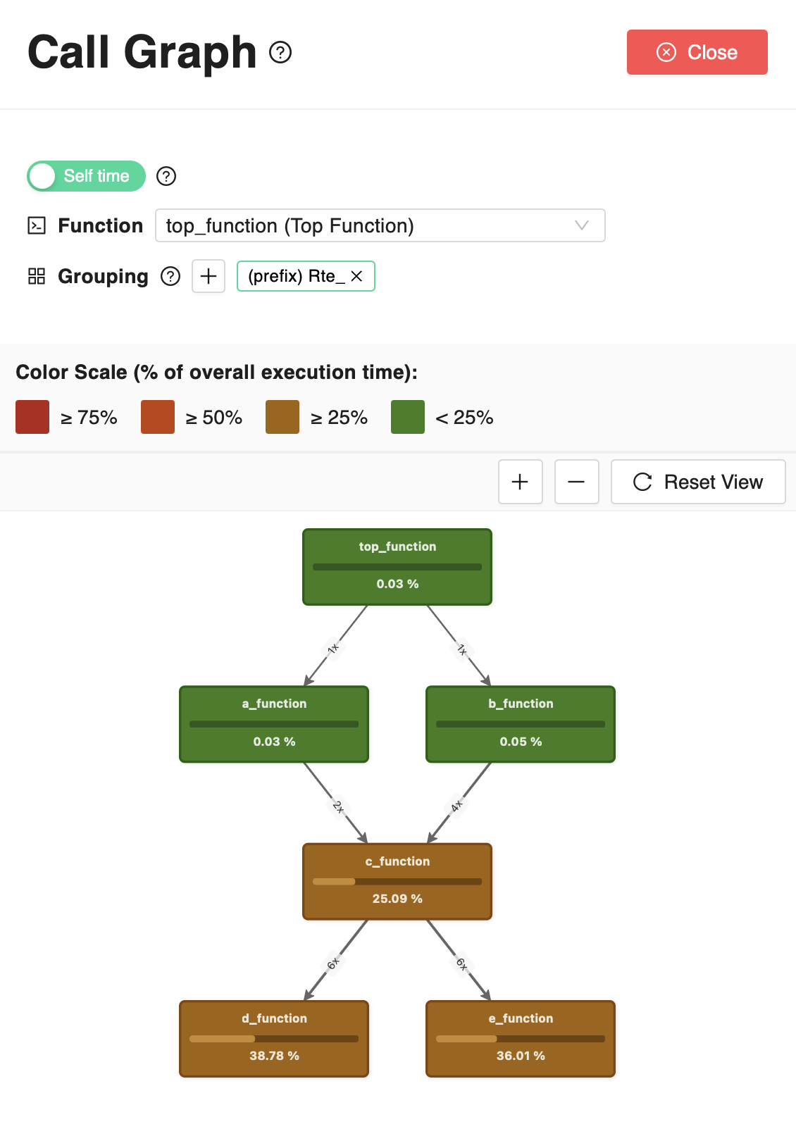
By clicking on the magnifying glass icon near each function’s execution time in the table
it is possible to access the function call graph, that provides a visual representation of the calling relationships between functions.
For any of the functions in the table, also selectable from the Call Graph explorer drawer, the Call Graph shows the function call made, directly or indirectly, by the selected function. Each node represents a function and shows the percentage of time (self time or total time, depending on the currently selected option) spent in that function with respect to the total execution time of the runnable. The edges represent the calling relationships between functions, and show the number of calls between the functions. Depending on the selected analysis type (as described at the beginning of this page), both the execution time and the number of calls is either that recorded on average over all the executions of the runnable in the analysis, or that recorded for the single longest execution of the runnable in the analysis.
In case multiple functions are tightly related and should be considered together, it is possible to group them in a single node, by setting a pattern in the Grouping section. By specifying a common prefix or suffix or a regular expression, all the functions matching the pattern and all the functions they call, directly or indirectly, will be grouped in a single node. Multiple patterns can be specified to group different sets of functions in different nodes, however, these patterns cannot overlap, meaning that a function cannot be part of two different groups. If a function matches multiple patterns, all the grouping patterns will be temporarily disabled until the overlap is resolved.
Execution Time Distribution
In this section it is possible to analyze the execution time of each data point / measure provided in input for the analysis. A chart shows the current and achievable execution time distribution, aggregated by number of executions. In the chart it is easy to identify if there are specific outliers depending on the input code. More detailed data is provided in a tabular fashion. The table provides information at the granularity of the single input / function call. Developers can order the table to identify which is the specific dataset causing an increase (or decrease) in the execution time, and act accordingly.
Optimizations
Optimizations opportunities identified by the tool are shown in this section. Available optimizations are shown in green, while not applicable, or already applied ones, are greyed out. The total saving provided by the optimization opportunities, assume that the optimization is applied to all functions involved in the execution of the main function.
Optimization opportunities section is pretty powerful, as it allows to see the impact of a specific optimization before applying it. In this way, it is possible to focus on the optimizations that have the greatest impact. In these regards, the tool is useful to perform impact analyses: the final decision is always of the developer/user, that knows if the specific optimization can be applied, or not.
Optimization focus on:
code optimization
variables mapping optimization
code mapping optimization
Variables and code mapping optimization, can be better targeted when providing a map file during HPROF generation. In this way, the tool knows the exact position of the symbols. It is also possible to manually define the position of the symbols, by specifying them on the JSON file provided to the Huxelerate utility during HPORF generation.
Variables mapping
This section shows the mapping of global variables to their corresponding memory location. By default, all global variables are mapped to a specific memory location that depends on the target ECU type. To test the impact of using different memory locations, it is possible to modify the variables mapping by specifying the variable addresses in the configuration file provided during the instrumentation step of the Huxelerate utility. The available memories and their corresponding address spaces are listed in the available memories section.
Code Mapping
This section shows the mapping of functions’ code to their memory location. By default, all functions are mapped to a specific memory location that depends on the target ECU type. To test the impact of using different memory locations, it is possible to modify the functions mapping by specifying the function address in the configuration file provided during the instrumentation step of the Huxelerate utility. The available memories and their corresponding address spaces are listed in the available memories section.
Available memories
List of available memories and corresponding address spaces for the target architecture.
User-defined HPROF
Whenever it is not possible to automatically generate an HPROF file using the Huxelerate utility, it is possible to manually insert an entry using the dedicated button at the top of the page. To create an user-defined HPROF file, the runnable must be defined in the software components section . Once the runnable and scenario are selected, it is possible to define the average and maximum execution time, and the its’ standard deviation.
Network Analysis
Network Analysis functionality can be used to analyze network load and response time in isolation (before or without ECU software availability), and can be used to:
obtain the bus load
analyze worst-case jitter and response time at the network message granularity
validate network quality KPIs such as maximum deviation from scheduled message period
statistically simulate the periodicity of sporadic messages and stress test the network under different use-case scenarios.
Launch a Network Analysis
By clicking on the “New Network Analysis” button, it is possible to customize the configuration of a new Network Analysis: * you must set the name for the analysis, the scenario and network to be analyzed; * moreover, you can specify a global release jitter, describing the variability with which outgoing messages are released from the transmission queue, whether to “Synchronize ECUs” and “Synchronize different message periods” start instants, as explained in the following section.
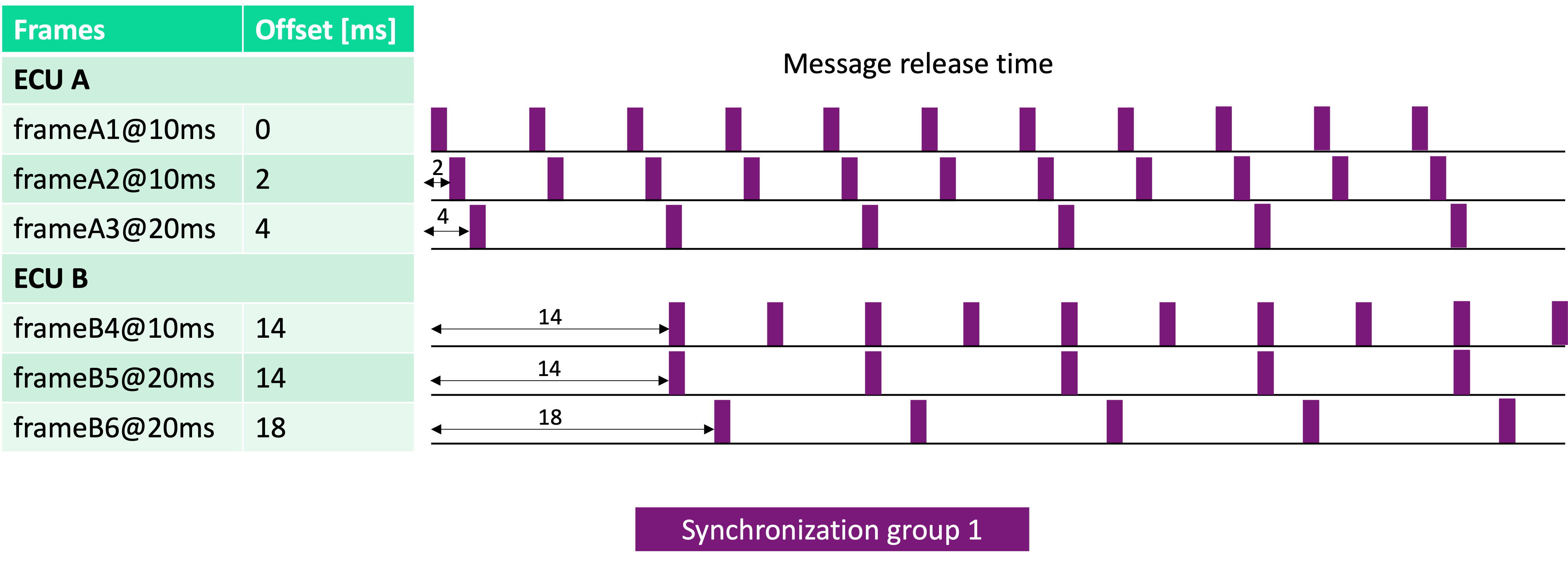
Periodic messages’ synchronization options
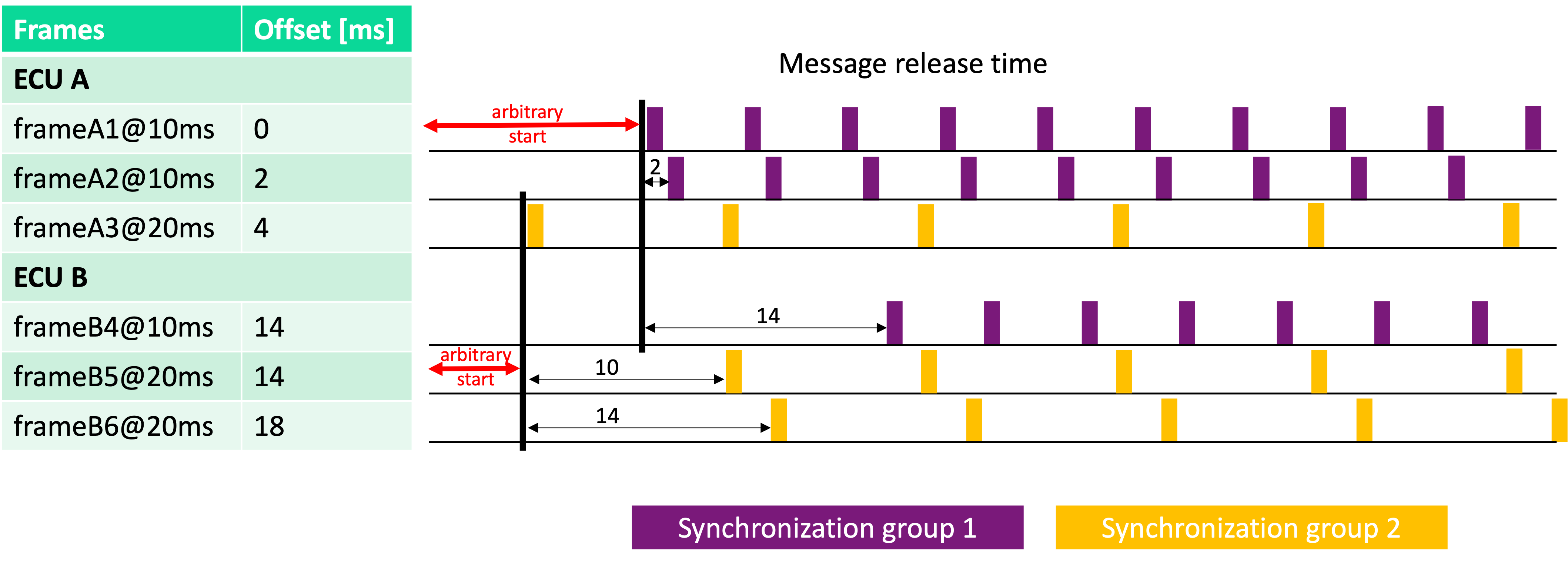
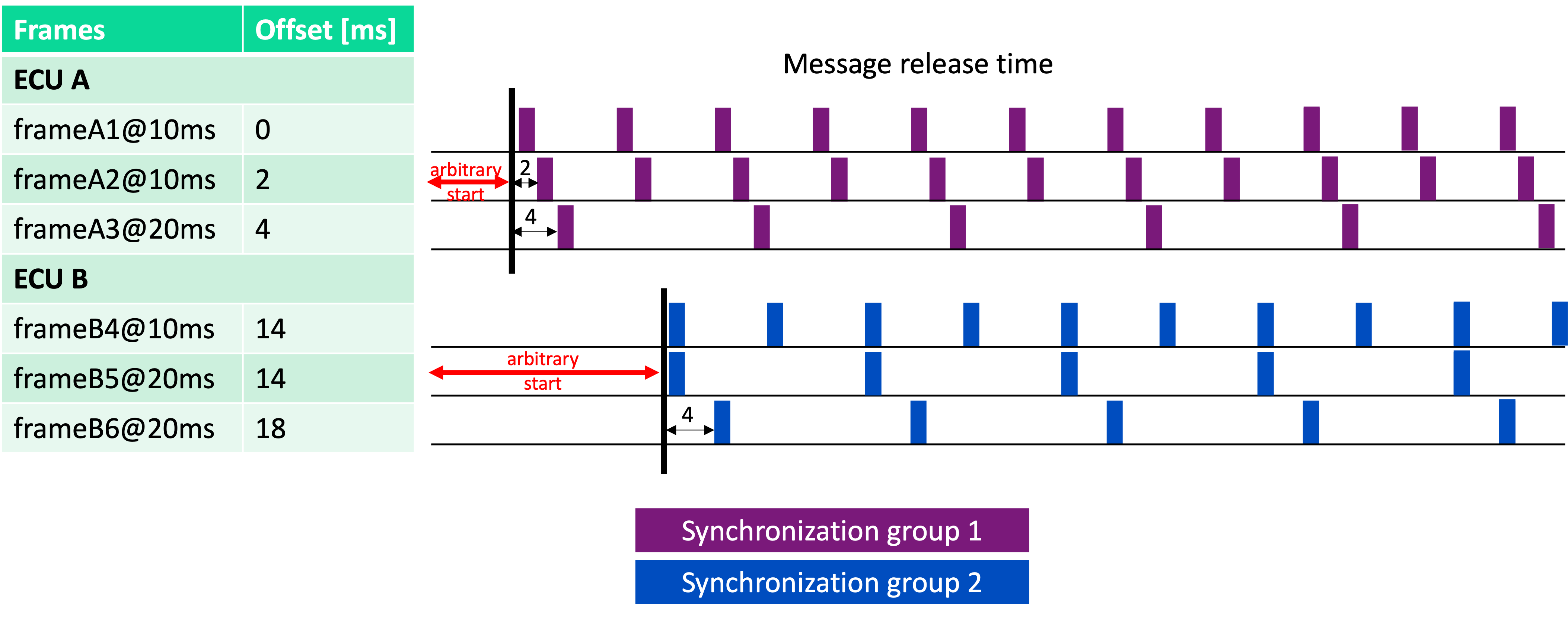
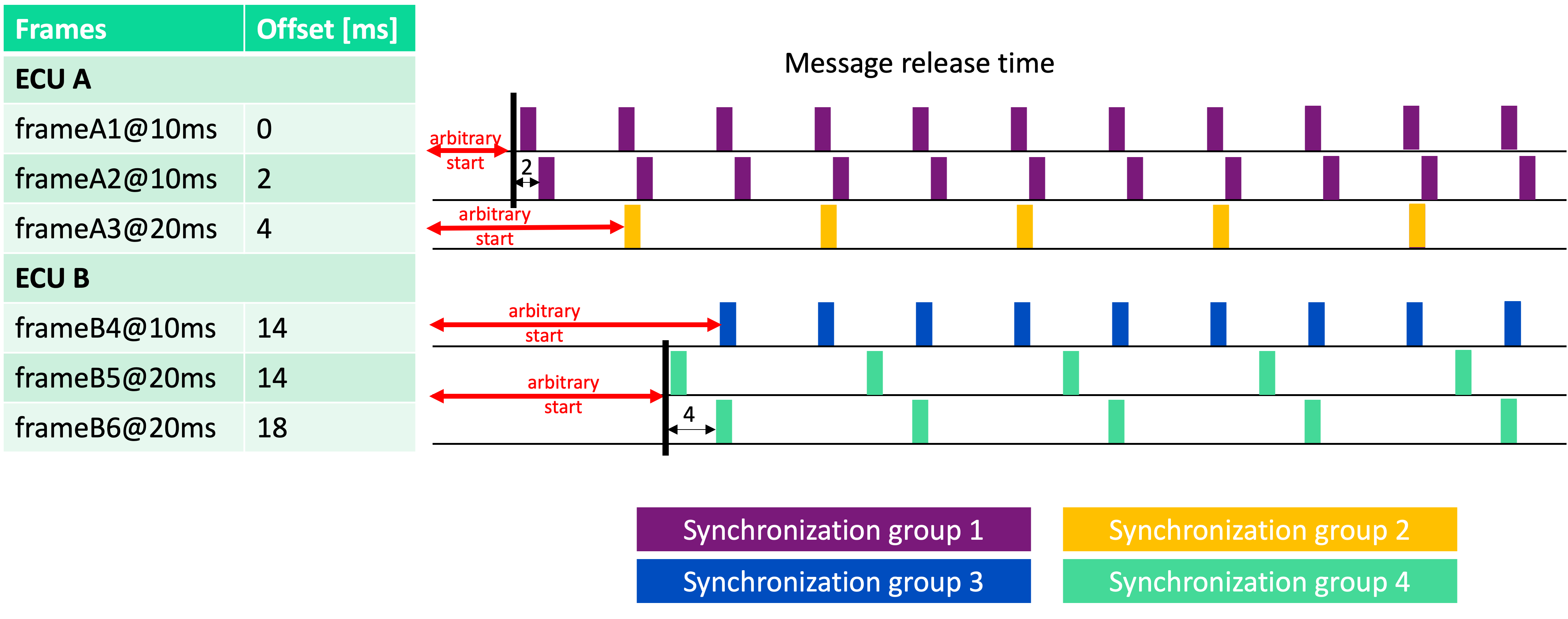
We categorize periodic network messages into different synchronization groups. Messages in the same group are scheduled to request transmission together.
Enabling Inter-ECU synchronization (“Synchronize ECUs” switch), ECUs are assumed to enable the communication stack in the exact same instant, leading to messages having the same period across all the ECUs to fall in the same synchronization group.
Enabling Intra-ECU synchronization (“Synchronize different message periods” switch), each ECU’s communication stack is assumed to start scheduling messages of every period at the same instant, leading to all the messages of each sender ECU to fall in the same synchronization group, ignoring their period.
As an example, consider two ECUs with 3 messages each, each of them with a specific offset. Enabling both “Synchronize ECUs” and “Synchronize different message periods” results as follows:
Enabling only “Synchronize ECUs”, the example results as follows:
Enabling only “Synchronize different message periods”, the example results as follows:
Disabling both “Synchronize ECUs” and “Synchronize different message periods”, the example results as follows:
Analysis
Once a network analysis has been launched and the results are ready, it is possible to navigate through results thanks to an interactive visualization, identifying:
bus load
misconfigurations such as overlapping signals within frames or signals extending beyond frame length
potential performance issues such as message periodicity inversions
underutilized frames
The interactive report allows to filter out messages by period or by type (periodic, sporadic, mixed) to focus on the specific messages and provide messages in two charts.
Moreover, the performance of the network can be evaluated according to two KPIs: Jitter and Worst-Case Response Time (WCRT), detailed in the following sections.
Jitter analysis
By jitter of a network message, we refer to a KPI accounting for the variability in the period between two consecutive periodic transmissions. For example, if a message is supposed to be sent every 10ms (i.e. the message period), and its recorded transmission times are 0.3ms, 10.4ms, and 21.2ms, the average jitter is 0.45ms and the maximum jitter is 0.8ms. The report highlights the maximum jitter for each message and allows to set a boundary to the maximum acceptable jitter, as a percentage of the message period.
Frame-wise jitter analysis
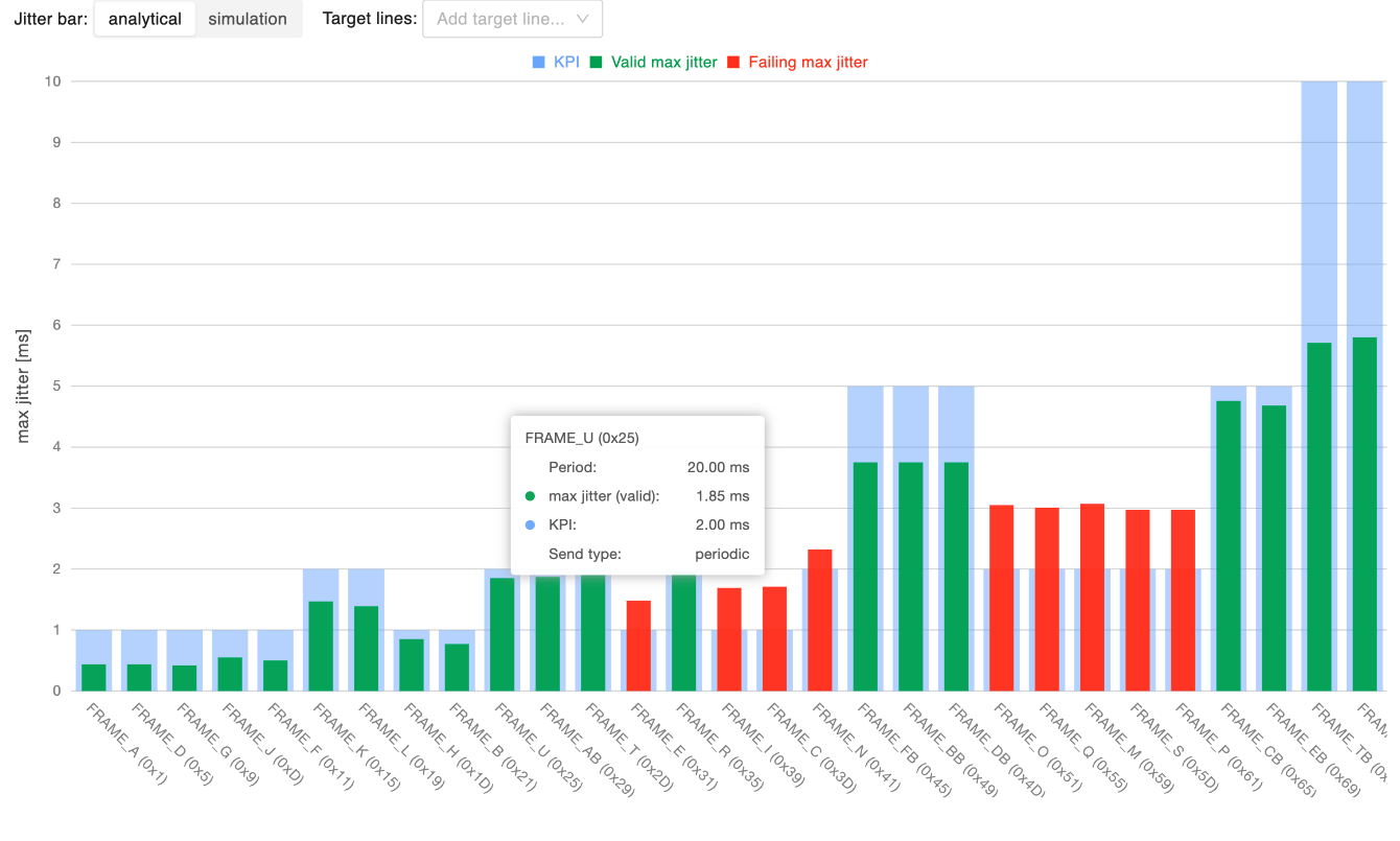
This chart shows the maximum jitter for each message, allowing to identify messages that experience excessive jitter, which may reduce the reliability of the network. On the x-axis of the chart there are increasing message identifiers (lower priority last), while the y-axis provides the maximum jitter time in ms. By setting a boundary for the maximum acceptable jitter (as a percentage of the message period), messages within the boundary are represented with a green bar, messages violating it with a red bar.
The maximum jitter is available both according to the analytical, worst-case, model and using the statistical simulation’s results, toggling the “Jitter bar” selector. Independently from the selected jitter computation method, it is possible to overlay the chart with target lines highlighting: * the maximum jitter according to the analytical model * the maximum jitter according to the simulation results, at a user-defined percentile over the distribution of the simulated jitter values.
Finally, clicking on a bar will open the relative message inspection.
Period-wise jitter analysis
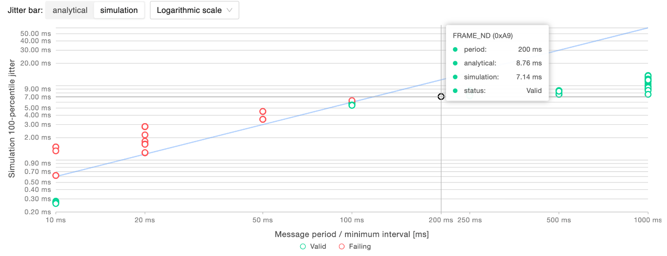
This chart allows to validate the reliability of the network in terms of stability for each message period. In the chart, every point corresponds to a message. On the x-axis there are increasing message periods (or minimum transmission intervals for non-periodic messages), while the y-axis provides the maximum jitter time in ms. The set boundary for the maximum acceptable jitter is represented by a line that separates messages within such a boundary, represented as green points, from messages violating it, represented as red points. In order to better accommodate a wide range of jitter values, it is possible to choose the type of visualization scale (linear or logarithmic). In the example above, information is reported in logarithmic scale, and the maximum jitter is set to be 6% of the period of the messages.
The maximum jitter is available both according to the analytical, worst-case, model and using the statistical simulation’s results, toggling the “Jitter bar” selector.
Hovering on a specific message it is possible to get its details: its period, its analytical maximum jitter and the simulated maximum jitter at the specified percentile.
Worst-Case Response Time (WCRT) analysis
By worst-case response time (WCRT) of a network message, we refer to a KPI accounting for the maximum time a message takes to be transmitted from the sender to the receiver, accounting for: * Queuing delay: the time a message spends in the transmission queue before being sent * Transmission time: the time it takes to send the message over the network * Release jitter: the variability in the time the message is released from the transmission queue
The report highlights the WCRT for each message and allows to set a boundary to the maximum acceptable response time, as a percentage of the message period (or minimum transmission interval for non-periodic messages).
Frame-wise WCRT analysis
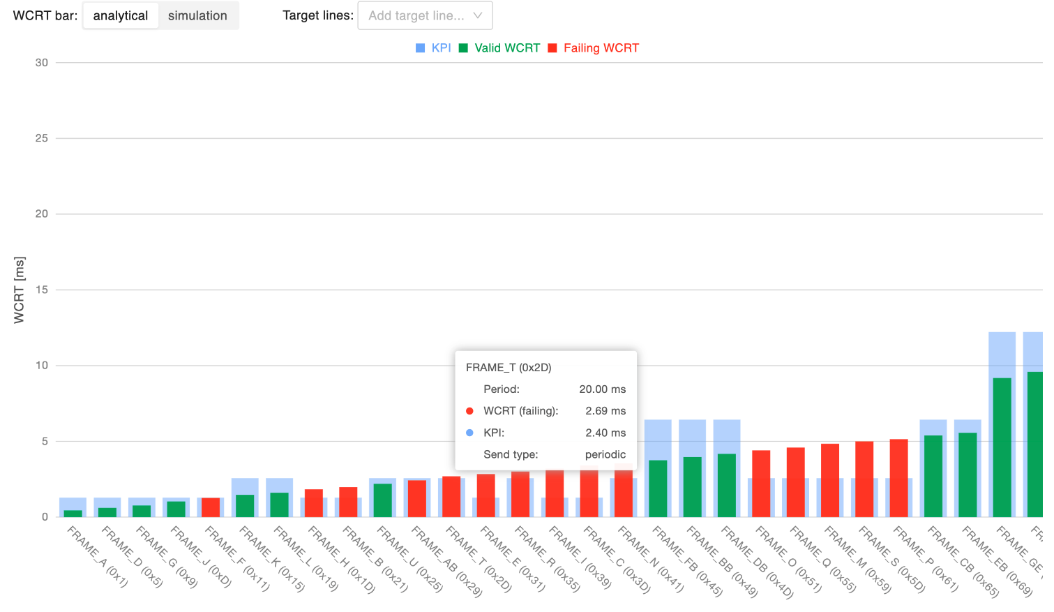
This chart shows the WCRT for each message, allowing to identify messages that experience excessive response time, which may reduce the reliability of the network and result in potential actual/expected message periodicity inversions. On the x-axis of the chart there are increasing message identifiers (lower priority last), while the y-axis provides the WCRT time in ms. By setting a boundary for the maximum acceptable WCRT (as a percentage of the message period, or minimum transmission interval, for non-periodic messages), messages within the boundary are represented with a green bar, messages violating it with a red bar.
The WCRT is available both according to the analytical model and using the statistical simulation’s results, toggling the “WCRT bar” selector. Independently from the selected WCRT computation method, it is possible to overlay the chart with target lines highlighting: * the WCRT according to the analytical model * the WCRT according to the simulation results, at a user-defined percentile over the distribution of the simulated WCRT values.
Finally, clicking on a bar will open the relative message inspection.
Period-wise WCRT analysis
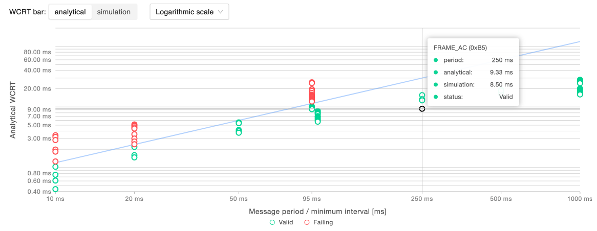
This chart allows to validate the reliability of the network in terms of stability of latency for each message. In the chart, every point corresponds to a message. On the x-axis there are increasing message periods (or minimum transmission intervals for non-periodic messages), while the y-axis provides the WCRT time in ms. The set boundary for the maximum acceptable WCRT is represented by a line that separates messages within such a boundary, represented as green points, from messages violating it, represented as red points. In order to better accommodate a wide range of WCRT values, it is possible to choose the type of visualization scale (linear or logarithmic). In the example above, information is reported in logarithmic scale, and the max WCRT is set to be 25% of the period of the messages.
The WCRT is available both according to the analytical model and using the statistical simulation’s results, toggling the “WCRT bar” selector.
Hovering on a specific message it is possible to get its details: its period, its analytical WCRT and the simulated WCRT at the specified percentile.
Analytical WCRT breakdown
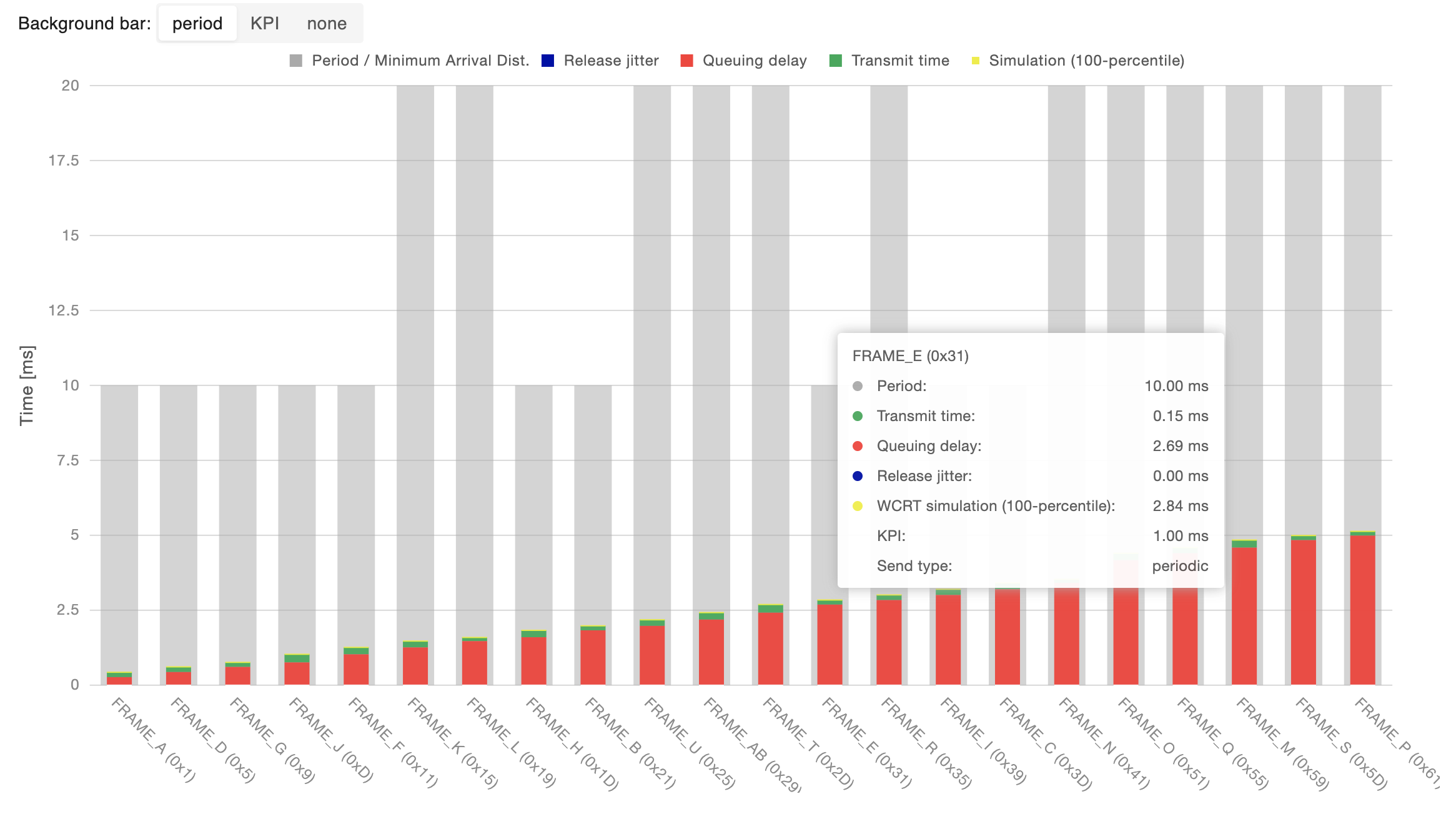
To further inspect the composition of the WCRT summarized in the previous charts, it is possible to analyze the breakdown of the analytical WCRT for each message into its components possibly comparing the result either with the message period/minimum transmission interval or the set KPI boundary on its WCRT.
Clicking on a bar will open the relative message inspection.
Message details
All the information summarized in the previous charts can be inspected in detail for each message by searching the message in the table present in this section. Clicking on the magnifying glass icon will open the relative message inspection.
Message inspection
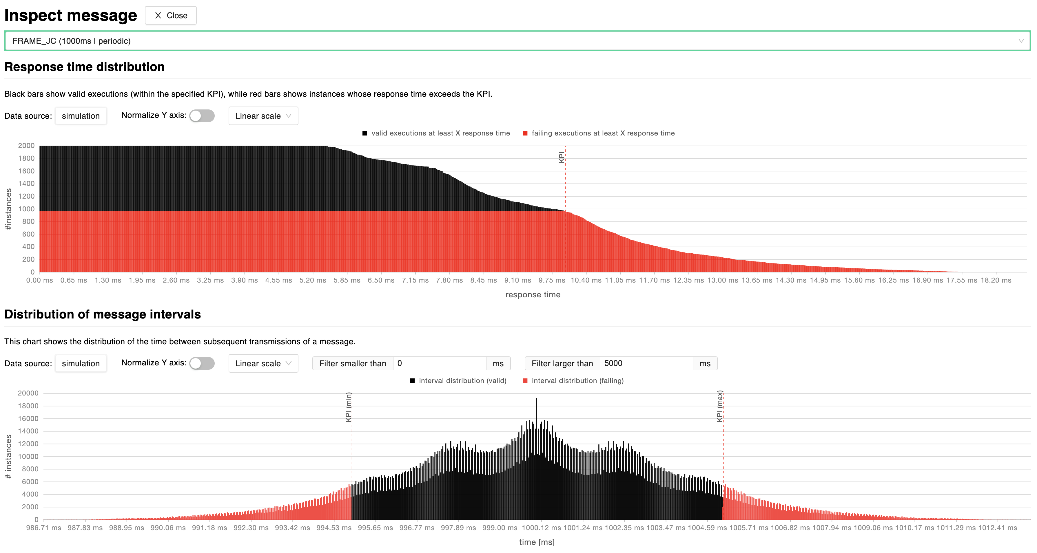
By clicking on a data-point of the charts described in previous sections, it is possible to inspect simulation results for the selected message. The simulation tests a high number of different executions to evaluate the probability of failing user-defined KPIs. This pane’s charts help the user navigate through the resulting probability distributions in order to understand the level of reliability for that specific message’s transmission timing.
Response time distribution: this chart shows the number of valid (black) and invalid (red) execution instances for which the message falls under a certain response time, for each response time. A dashed red line marks the maximum acceptable response time based on user-defined KPIs. It is possible to normalize the y-axis by switching to a percentage scale and switch between linear and logarithmic scales.
Distribution of time intervals: this chart shows the distribution of the time between subsequent transmissions of a message, highlighting the parts of distribution which are failing (red) user-defined KPIs and those who are valid (black). It is possible to normalize the y-axis by switching to a percentage scale and switch between linear and logarithmic scales. In addition to that, the user can also set upper and lower bound time filters.
Exploration
This section allows to stress test your network to understand possible scenarios that could lead to unintended network occupancies. Provided a scenario in which network and messages have been defined, define a global jitter and a probability distribution to launch a network performance exploration. The analysis will generate multiple scenarios following a probability distribution that will modify the minimum interval between transmissions of sporadic and mixed messages, also check the impact over the network. The report is pretty useful to see, for example, the bus load of network where there are messages that can be originated by a driver/user (i.e. non-periodic).
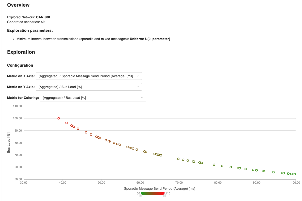
The generated chart is configurable as you have the opportunity to customize the information by modifying the x and y-axis. In the example above, the chart has been configured with the average sporadic/mixed message send period in ms on the x-axis, while the y-axis shows the % bus load. Furthermore, a metric for coloring has been indicated to show how the bus load increases with the increase of the delivery frequency of messages. Each point of the chart, corresponds to a scenario, where messages have been sent with the average period defined in the x-axis. For each scenario (data point), it is possible to obtain detailed information at the message granularity (by obtaining the Response Time Analysis and Relative response time violations charts)
Huxelerate Network Inspector
The Huxelerate Network Inspector is a utility that allows to inspect a given network trace file (blf) and the corresponding DBC to produce a .hnet file that collects metrics and statistics on messages behavior.
To generate an .hnet, please download the hux-network-inspector.
To get comprehensive information on all the arguments to pass to the utility tool, run the following:
Windows:
hux-network-inspector.exe --help
Usage Example
A common usage example of the tool can be found below:
hux-network-inspector.exe \
  -d network.dbc \
  -i trace.blf \
  -c 0 \
  -a 500000 \
  -o results.hnet \
  -m 10000
HNET upload
Once the .hnet file generation is complete, it can be uploaded to the platform to visualize all statistical data of the network messages.
When opening a network analysis, click on the Upload HNET button and choose the HNET file from your system.
As soon as the upload finishes, you may visualize the traced data on the graphs alongside with the network analysis data.
There also is a detailed table containing the messages statistics, both for analytical, simulated and traced data.
Note
If the DBC file used to populate the network frames is not the same used to generate the HNET file, there may be mismatches, or some of the traced data may be missing.
Huxelerate Network Unpacker
The Huxelerate Network Unpacker is a utility that allows to unpack CAN messages incapsulated in an Ethernet frame, following Autosar Bus Mirroring specification , or `AVTP Mirroring specification`_ . Starting from a trace file(.blf, .pcap, .pcapng), it generates a new blf containing the unpacked CAN messages.
To unpack messages from a .blf, .pcap or .pcapng file, please download the hux-network-unpacker.
To get comprehensive information on all the arguments to pass to the utility tool, run the following:
Windows:
hux-network-unpacker.exe --help
Usage Example
A common usage example of the tool can be found below:
hux-network-unpacker.exe \
  -i input_with_packed_messages.pcapng \
  -o output_with_unpacked_messages.blf
Note
In case of issues with license validation, the Huxelerate Network Unpacker offers a flag to skip SSL verification with the –skip-verify-ssl option.
Configuration via .ini file
The unpacker can also read a .ini-style configuration file containing
key=value pairs by passing path to the config file using the --config or -c option. Keys are plain identifiers and values are parsed as strings; a
key appearing without an =value can be used as a boolean flag (enabled when
present). __Relative paths__ are interpreted starting from the current working directory.
Sample .ini file:
input-path=./input.pcapng
report-filename="report.log"
rule-file=rules.txt
output-mirroring-messages-only
Common keys:
input-path: path to the input file to process.report-filename: path/name of the log or report file to write.rule-file: path to the rule file (see Rules syntax section).output-mirroring-messages-only: flag that, when present, enables writing only unpacked mirroring messages to the output (no other frames).
hux-network-unpacker rules file: syntax
This section describes the syntax of the rules file consumed by hux-network-unpacker. Rules allows matching incoming
messages and select a target channel in the output blf to write them to. Rules are evaluated in
file order; the first matching rule wins. To pass the unpacker a rule file, use the
--rule-file or -r command-line option, or specify the rule-file key in the config file.
Basic format
Each rule is one line. Blank lines and lines starting with # are ignored.
General shape:
<criteria> -> <target>
<criteria> is a, possibly empty, comma-separated list of key=value pairs. The <target> specifies the channel number to assign when the rule matches.
Accepted target forms:
-> 5                (assign channel 5)
-> channel=5        (assign channel 5 — `channel=` is optional)
Supported criteria keys
netid— numeric network id
mac— source MAC address (non-hex characters are ignored)ip— source IP addressprotocol— origin protocol string (valid values are autosar_mirroring, avtp_mirroring, can_input)
Notes:
MAC matching is normalized:
aa:bb:cc:DD:ee:ff,aabb.ccdd.eeff,aa-bb-cc-dd-ee-ffand uppercase/lowercase variants match the same value.All comparisons are exact matches;
netidis compared numerically.
Behavior and semantics
Rules are evaluated in file order; the first rule whose every criteria matches will be used.
An empty criteria list (i.e., nothing specified before the
->symbol) means the rule has no criteria and will match every message — use as a default/catch-all.An empty target (i.e., nothing specified after the
->symbol), means the messages will be associated with the the configureddefault_channelwhen that rule matches.
Edge cases and pitfalls
An element in the criteria list that is missing the
=symbol (for example10 -> 5where10is written withoutkey=) is ignored when parsing criteria. That makes the criteria list empty and the rule matches all messages. Always usekey=value.For a default channel prefer a final explicit rule such as
-> 5rather than relying on a malformed criteria list.Because matching is “first match wins”, list specific rules first and general/catch-all rules at the end of the file.
Sample rules
Match a message from network id 2 and send to channel 5:
netid=2 -> 5
Match by source MAC and send to channel 3 (MAC can use any common notation):
mac=aa:bb:cc:dd:ee:ff -> channel=3
Match a source MAC + protocol combination and route to channel 6:
mac=12:34:56:78:9a:bc,protocol=autosar_mirroring -> 6
Default/catch-all rule (put at end of file) — send everything else to 2:
-> 2
Example rules.txt
# route source MAC aa:bb:cc:dd:ee:ff to channel 3
mac=aa:bb:cc:dd:ee:ff -> 3

# route source IP 192.168.10.24 to channel 4
ip=192.168.10.24 -> channel=4

# route Autosar mirroring from MAC A1-B2-C3-D4-E5-F6 to channel 10
mac=A1-B2-C3-D4-E5-F6,protocol=autosar_mirroring -> 10

# route an exact netid+mac+ip+protocol tuple to channel 11
netid=5,mac=aabb.ccdd.eeff,ip=10.10.0.15,protocol=avtp_mirroring -> 11

# everything else -> channel 2
-> 2
Tips
Test rules with a small capture and enable logging to verify mappings.
Keep the rules file ordered from most specific to least specific.
Use exact values: there is no wildcard or regex support.
Resource Analysis
Resource analyses provide information about the resource utilization for a specific scenario.
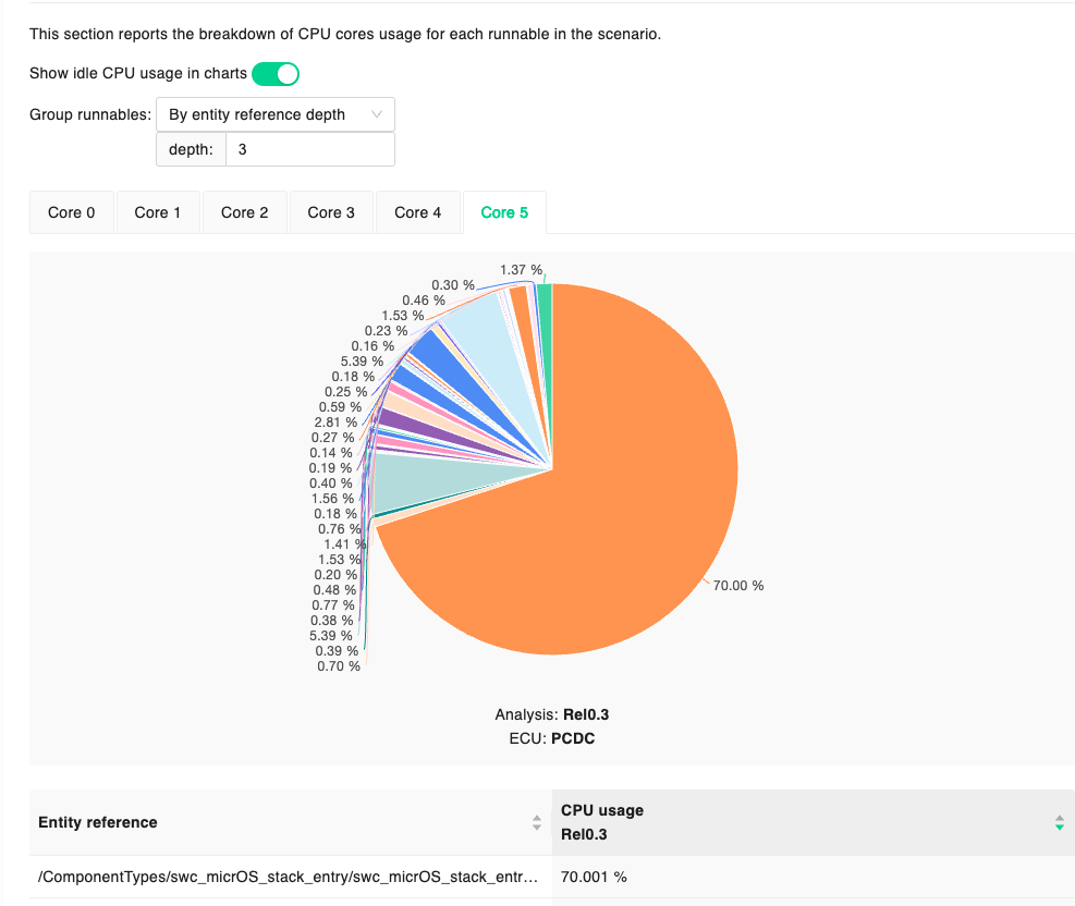
The report is mainly composed of two sections:
an overview of the resource utilization
a breakdown of the CPU usage
The overview provides current and achievable CPU usage per each core of the analyzed ECU Type, while the breakdown provides more detailed information on resource occupancy of each periodic runnable. In the second section of the report, it is possible to group runnables to get resource usage information of groups of software (e.g. Autosar compositions).
Timing Analysis
A Timing analysis is the result of the simulation of a specific scenario defined in the system definition section. The simulation involves all the information provided in the scenario (ECUs, networks, software components, task mapping and timing constraints), and allows to analyze the system in its entirety, providing information on:
resources occupancy
timing constraints violation
interactions among software functions (e.g. preemption)
information about software functions (e.g %time executing, %time ready)
Timing analyses can be launched on different scenarios, and different task mappings. Software function execution data is taken from the runnable performance reports originated from the HPROFs, and their periodicity can be simulated with a Gaussian distribution, or by using always the longest execution time. It is possible to define a simulation schedule (i.e. which runnable/function is active and when). By default, all runnables/functions are active during the simulation however, to specify a different behavior where specific runnables/functions are active, it is possible to define states in the operation modes section, and specify the transition upon analysis launch.
The last piece of information to provide for performing a timing analysis is the profiling data, that is the specific version of the performance report to use for the analysis.
Timing Analysis report
The report presents a hierarchical view of the performance information of the simulation. The first level of information is represented by a graphical view of the occupancy of each resource (network, ECU).
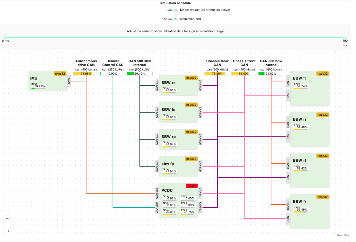
The chart shows the interconnections, and percentage occupancy of each core of the ECUs, and networks involved in the simulation. Each occupancy is flagged with a specific color, to highlight potential problems linked with resource occupancy.
Occupancy information is detailed in a tabular format both for compute and network resources.Compute resources are organized for each ECU and corresponding core, showing information for each task, regarding the percentage of time in the running, ready and suspended states. By expanding the specific task, it is possible to see the detailed information about a specific function.
Regarding network resources the information provided indicates the percentage of running and ready time for each message, on the specific network resource.
The final part of the report regards event chains. Within the simulation, the system checks whether, the timing constraints are met for each event chain, providing its success rate. By clicking on the specific event chain, it is possible to observe a gantt chart with the corresponding interactions, and (if present) the specific failing instances.
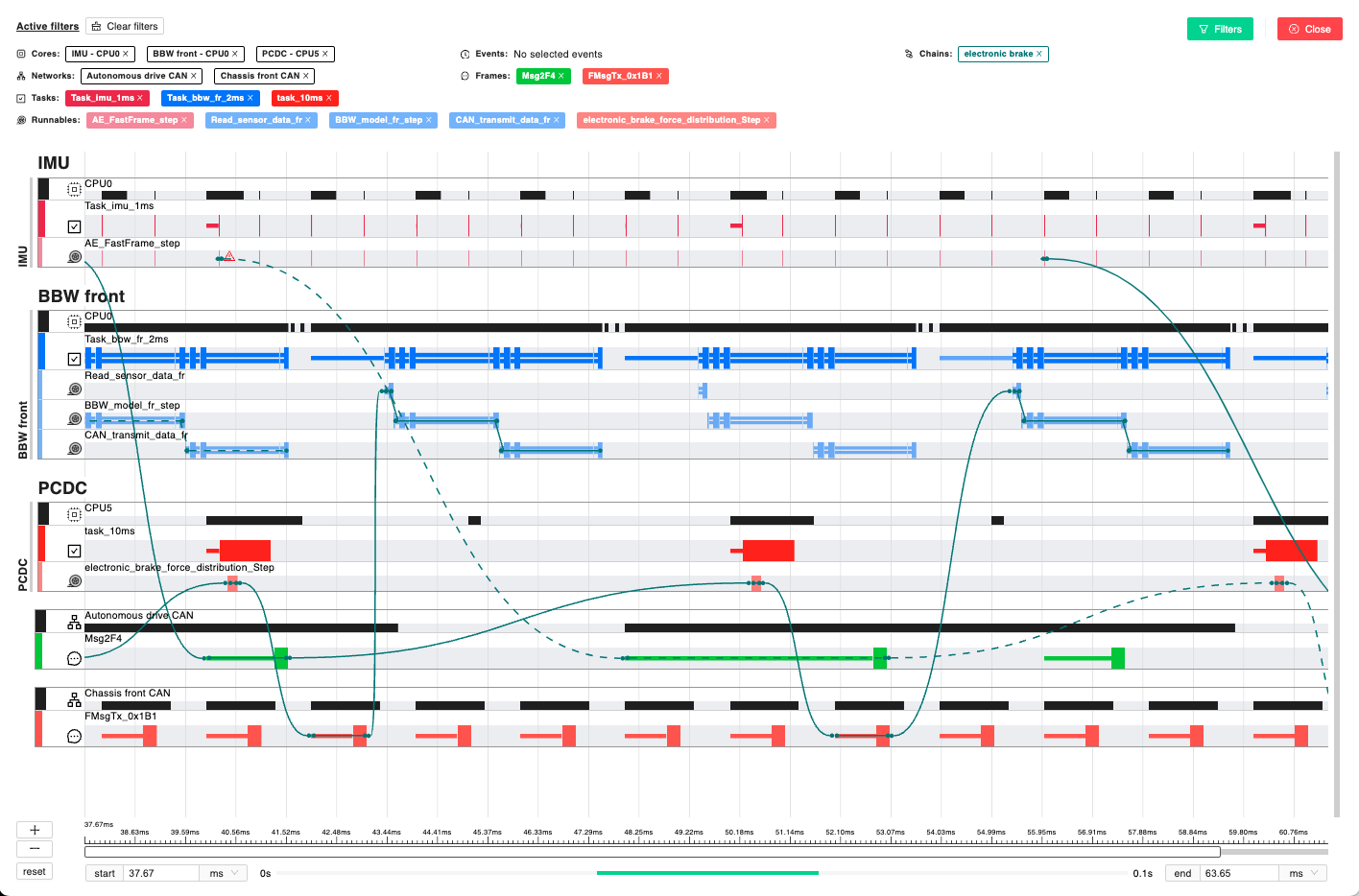
Failing event chains are shown with a dotted line, and, by clicking on the line, it is possible to get more details about it. The gantt chart shown by clicking on the action button near an event chain, abstracts all the information about the simulation to focus on the specific timing requirement. However, it is possible to get the whole simulation data by clicking the “Show Timing Gantt” button.
The “Show Timing Gantt” button provides the complete simulation data in a hierarchical way. The top level is represented by the ECUs and the network, and it is possible to deep dive into the runnable/function execution. To focus the visualization, it is possible to use the filter at the top-right of the screen. The status of a task or runnable/function is represented by three possible views, as explained in the examples below:
rectangles indicate a running task/function/runnable
single lines indicate a task/function/runnable that is ready, waiting for some other element with higher priority
double lines indicate a task/function/runnable that is suspended by some other element with higher priority
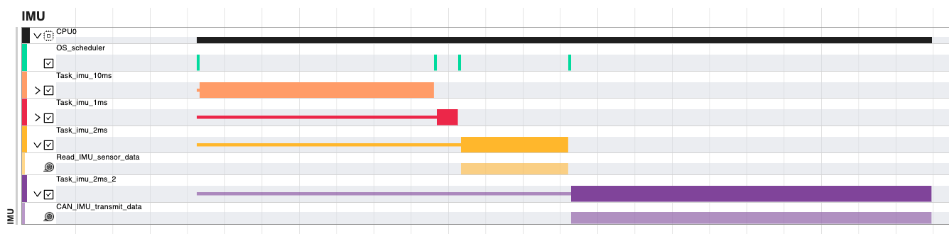
In the picture above, Task_imu_2ms stays in ready state as Task_imu_10ms and Task_imu_1ms have higher priorities, and then transition ready when the aforementioned tasks terminates execution. This interaction is shown in the gantt with a single yellow line, followed by the yellow rectangle.
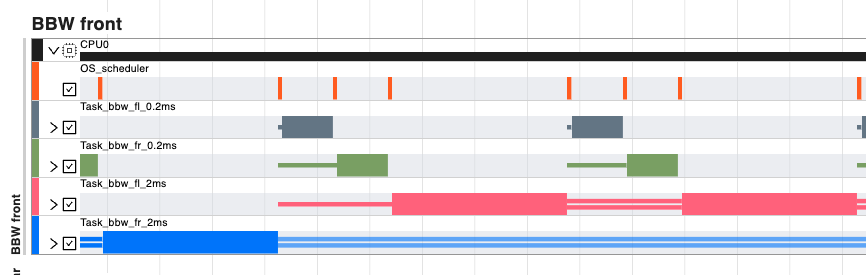
In this second example, it is observable how Task_bbw_fl_2ms gets preempted by the Tasks ad 0.2ms. In this case the interaction is shown with double lines.